Traditional learning materials often feel overly academic or, worse, forgettable. The goal was to create workbooks that felt approachable, like a teammate sharing clear, helpful notes, while still supporting real retention and engagement.
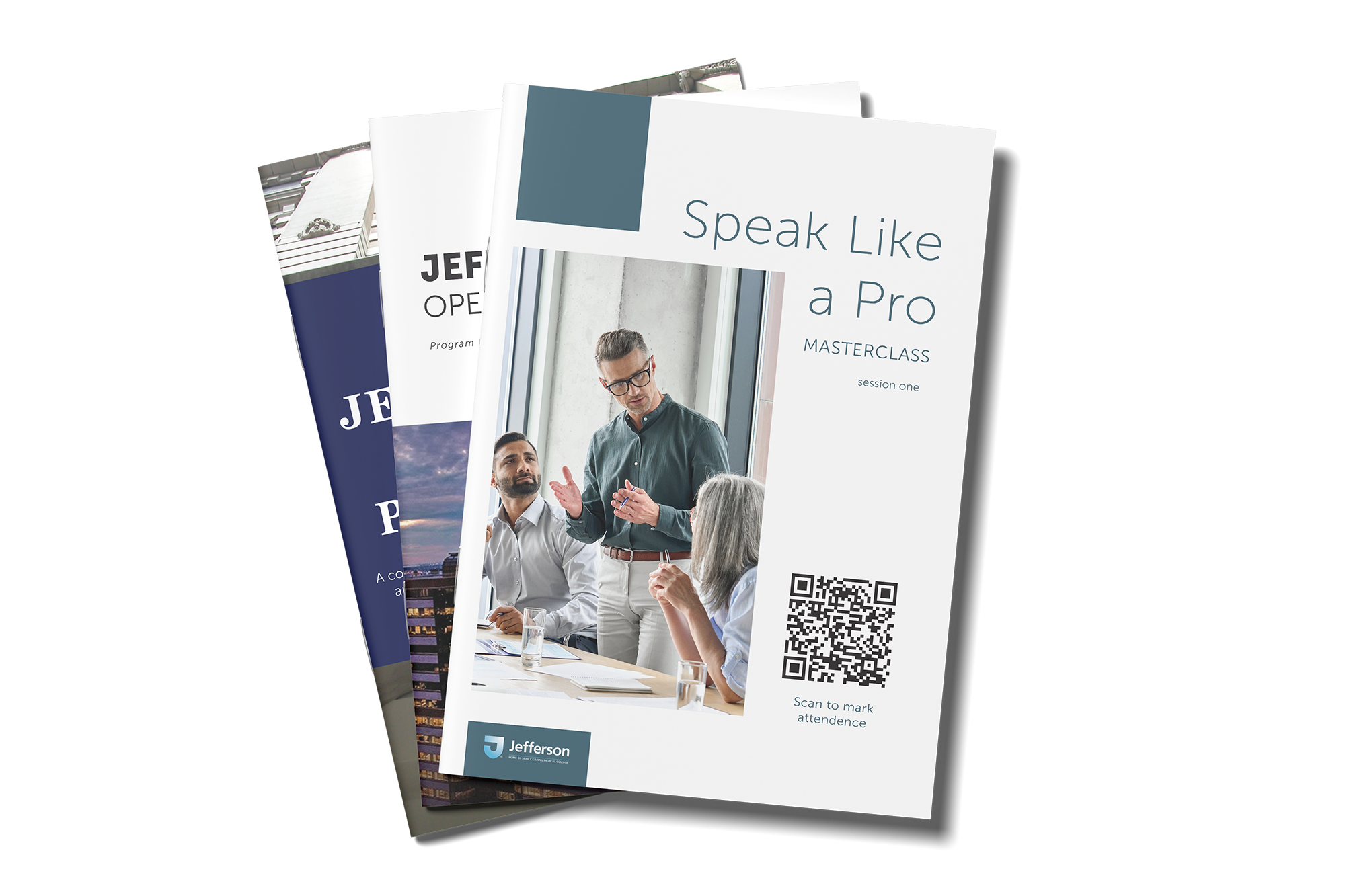
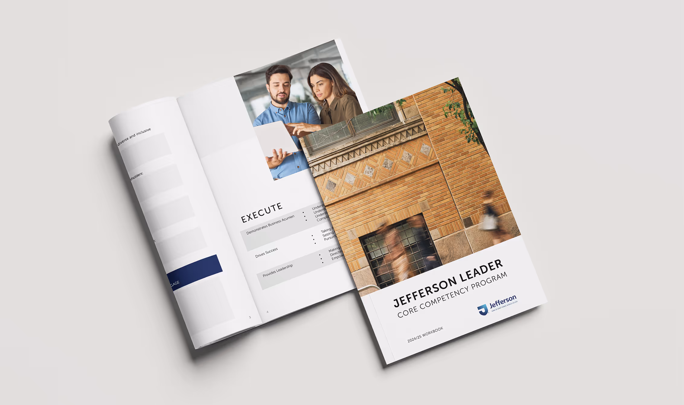
Each course had its own unique topic and learning objectives, but the workbooks needed to share a consistent voice: professional yet friendly, aligned with Jefferson’s brand standards. The design challenge was to strike that balance by ensuring every workbook looked distinct to its course, but unmistakably part of the Jefferson learning ecosystem.
On top of that, delivery formats varied: some courses required printed workbooks for in-person use, while others needed digital versions for Zoom sessions. This meant designing for multiple contexts of interaction without losing cohesion.
To address these challenges, I focused on making each workbook clear, approachable, and tailored to its context, while maintaining a strong Jefferson brand identity.
Each workbook was designed to reflect its specific course objectives and tone while maintaining a consistent visual and editorial identity. By following Jefferson’s brand guidelines, the suite felt cohesive and professional, yet each workbook still carried its own distinct character to match the subject matter.
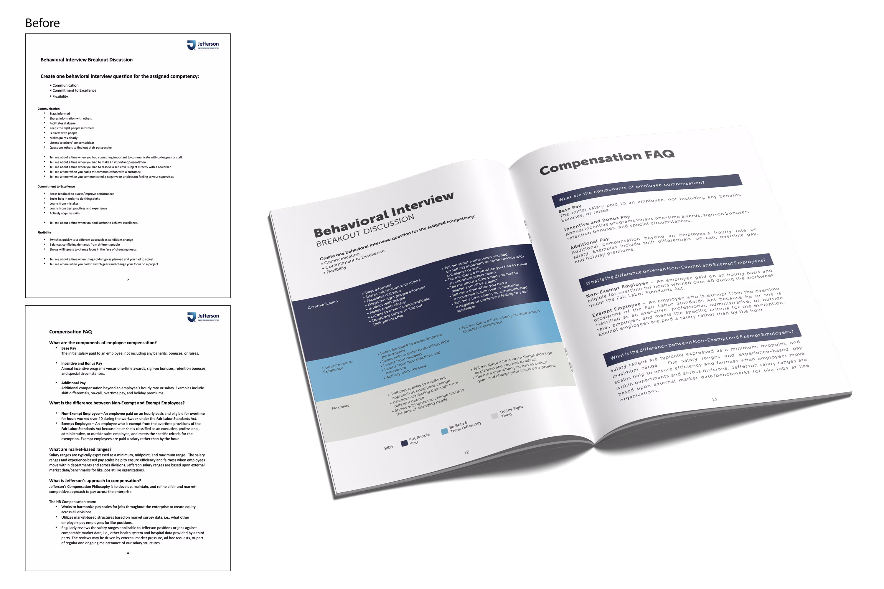
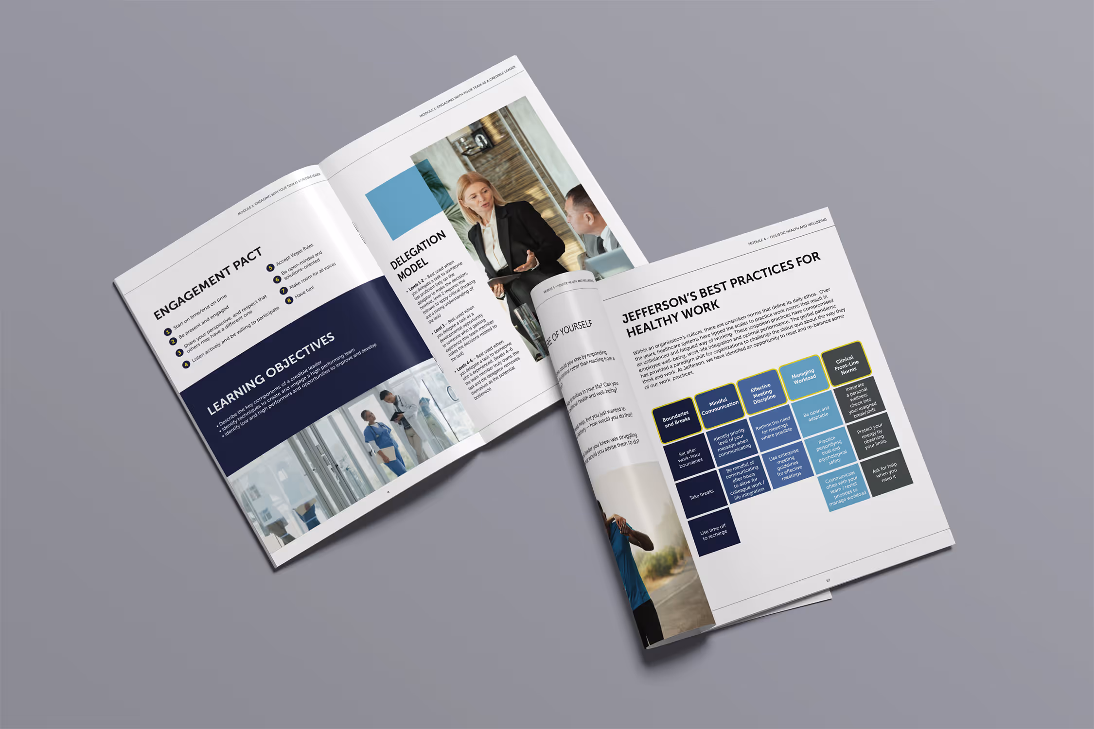
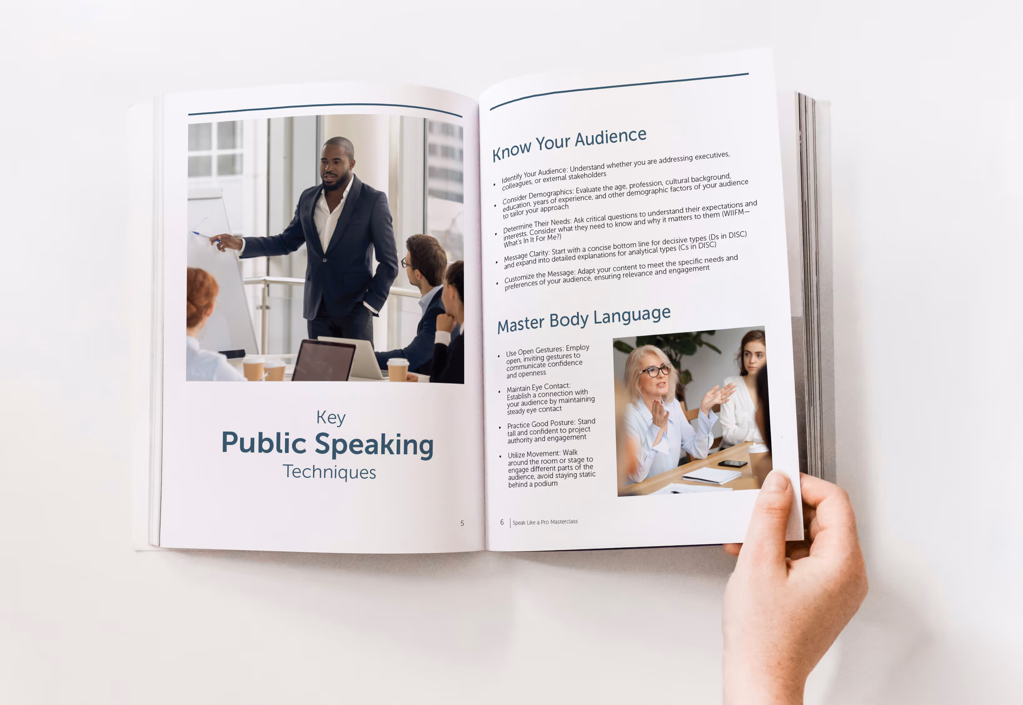
Course materials and presentation decks were carefully reviewed to identify the essential information learners needed most. Any excess content was trimmed so the workbooks supported, rather than duplicated, the live presentations. The final material was organized into clear sections with approachable language and intuitive headers, making each workbook easy to follow and more engaging to use.
Both formats were tailored to their specific learning environments. For digital workbooks, interactive text fields, clickable hyperlinks, and easy navigation supported Zoom-based sessions and real-time engagement. Printed workbooks included generous space for handwritten notes, QR codes and easy-to-type URLs for supplemental resources, and layouts optimized for readability in print.
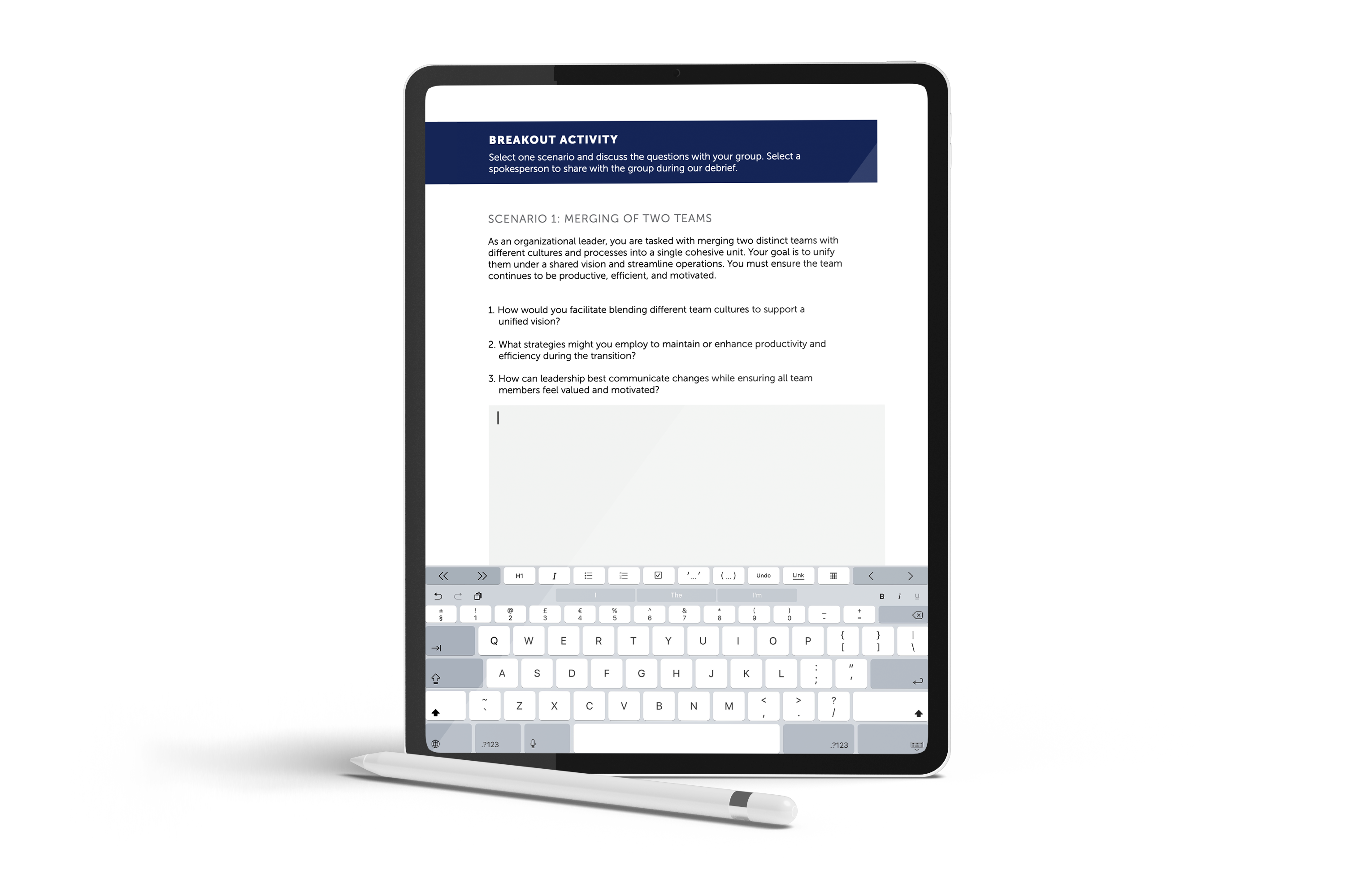
The workbooks were designed to feel more like helpful study guides than dense manuals, making the content approachable and easy to digest. Usability was prioritized throughout, ensuring learners could engage with the material in real time, whether jotting notes in the margins during an in-person session or clicking a link mid-Zoom.
To design a site where customizing collars felt effortless, research combined stakeholder input, competitive insights, and early user testing. Conversations with the business owner clarified pain points, priorities, and common customer questions. A review of competitor websites surfaced best practices and gaps in how customization options were presented. Before launch, a small group of test users walked through the site to check flow and identify any confusing areas, and their feedback informed final refinements. After launch, informal customer feedback continued to guide tweaks and improvements. Together, these steps ensured the website aligned with business goals while delivering a smoother, more intuitive shopping experience.
For Learners: Workbooks felt less like “required reading” and more like useful guides. The approachable tone, interactive features, and space for notes supported real engagement and retention.
For Facilitators: By trimming the content, presentations could focus on discussion and interaction, while the workbooks reinforced key takeaways.
For Jefferson: The collection created a cohesive ecosystem of learning materials—consistent in brand and quality, but flexible enough to adapt to different courses and delivery formats.
The project demonstrated that enterprise learning doesn’t have to feel stale—it can be professional, approachable, and genuinely helpful.
Looking ahead, the workbooks could evolve into fully interactive digital versions, via tablet for in-person sessions, integrated with assessments, multimedia links, and supported through Qualtrics and Jefferson’s LMS. This approach would allow the resources to grow alongside shifting learning formats. Continuing to keep learners engaged, and be more than just another workbook.